Introducing the new website for Sandberg Instituut Sandberg
We are very pleased to launch the new website for Sandberg Instituut. The project was initiated by Public Sandberg (Sasa Ghanem Chaney and George Sinclair), designed by Correspondence (Lukas Engelhardt, alum of Design Department 2022 and Justus Gelberg), and built by web developer Robin van de Griend. The redesign sought to retain the institution’s core identity, while improving its functionality and updating it for the present day.
Here's a note from design studio Correspondence:
“In 2025 we designed the new institutional website for the Sandberg Instituut in Amsterdam. The website succeeds a 2013 design by former studio Lust – an ambitious project of its time that used the metaphor of the library as a guiding principle for the development of a democratized visual language. Our goal was to retain the design’s strengths while updating the parts that had become outdated with time.
The website is based on a 7-column grid derived from the building itself – a design by Dutch architecture firm Benthem Crouwel from 2003. The unique menu structure follows the placement of windows on the building’s South Facade. This approach of using the building as an underlying structure for design work was loosely inspired by Teun Castelein’s 2006 work Artvertising, in which he rented out tiles on its facade as advertising space.
Apart from day-to-day information, the website consists of a vast archive of past works and events by students, alumni and staff. The new design is modular, responsive and fluidly adapts to a vast range of content. Together with developer Robin van de Griend, we focused from the start on preserving this multiplicity of voices, enabling users to explore and get lost in rabbit holes.
At the core of the new typographic system is a new version of Bill, the bespoke typeface drawn in 2013 by studio Carvalho Bernau, which we updated together with them and turned into a variable font. At its core, Bill is a monolinear interpretation of Caslon, to which a stroke has been applied. The new version pushes this idea to the edge of what can still be considered legible and comes in two versions, with round and square terminals.
At the Sandberg Instituut, the individual departments maintain a high level of autonomy. Our design highlights this by giving each department more agency over their pages, both in terms of content and design. Not only can they choose what information to display and but also their own color scheme and even which version of the typeface to use, similar to the way websites like Myspace used to allow users to personalise their profiles.”
May 2026
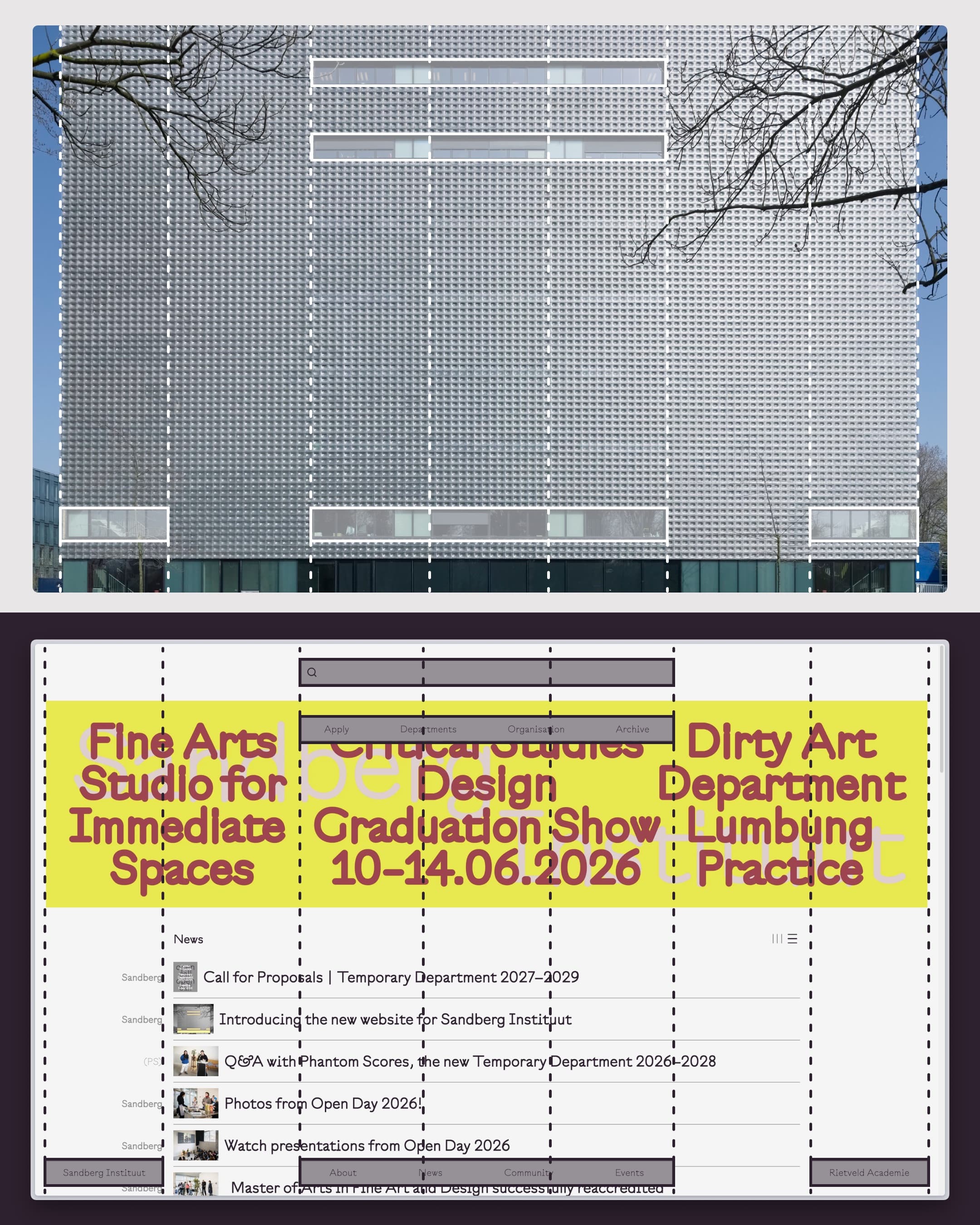
Structural concept visualised: The website is based on a 7-column grid derived from the BC Building.